← Home
The Challenge
As Sime Darby scales its platform, implementing a design system becomes imperative to ensure a cohesive and streamlined user experience across the growing array of services. A design system provides a standardized set of elements, patterns, and guidelines, facilitating consistency in branding, usability, and functionality. This not only accelerates the development process but also enhances user familiarity and trust, crucial factors for a successful and scalable platform expansion.
Role
Design System Lead
Team Model
Federated
Tools
Figma, Github, StoryBook, Flutter and lots of discussions
Why Design System?
Upon joining Sime Darby, our initial team of six designers was distributed across various squads, each dedicated to different products and managing multiple libraries. The cumulative count reached a significant ten libraries, posing a considerable challenge in terms of maintenance.
The typical workflow of a functional squad in the day-to-day product process involves extensive communication. Decisions on component integration, functionality, and collaboration between designers and developers often lead to disruptive and time-consuming meetings. This iterative process, often marked by disruptive meetings and inefficiencies, underscores the imperative for a Design System.
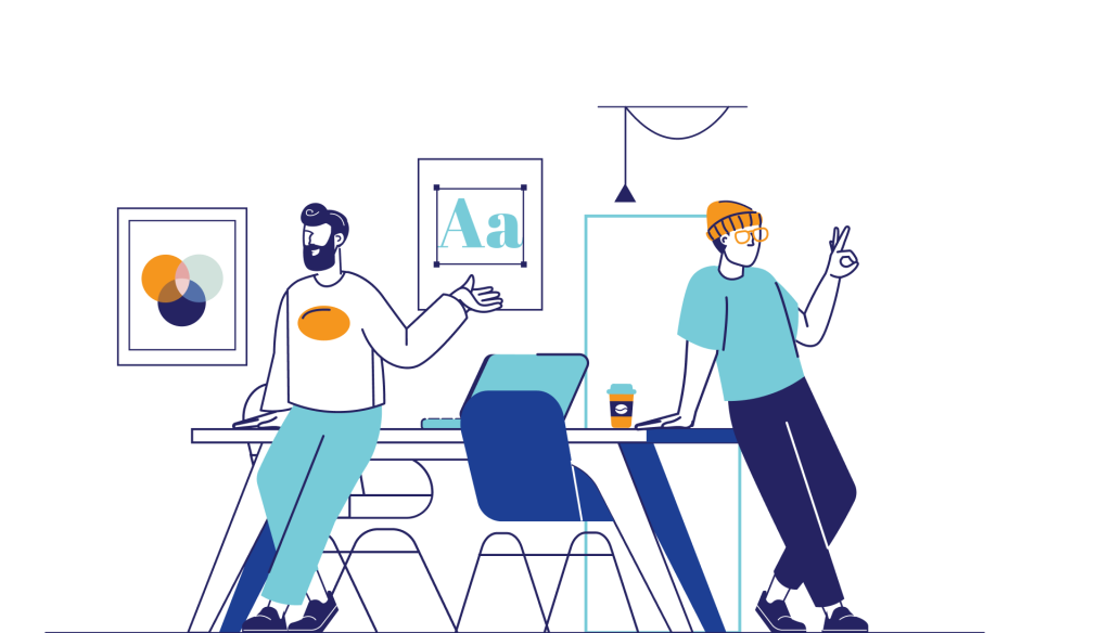

Previous ways of working
What are the Benefits
Recognising the significance of streamlining and unifying our maturing digital team, the implementation of a Design System emerges as a strategic initiative. This systematic approach aims to optimise workflows, mitigate interruptions, and empower squads to singularly focus on the efficient delivery of impactful products.
Common Language
Improve collaboration between teams by providing a shared vocabulary and set of tools.
This help teams to work more efficiently and effectively, and it can also help to improve the quality of the interfaces that they build.

Scalability
Easily adapted to different projects and scales well for larger teams.
This is because it uses established patterns and conventions that are easy to follow. As a result, you’ll be able to create designs faster and with fewer errors, which will save time and money.

Deployment Speed
Help to reduce development time by providing teams with a library of pre-built components that they can use to build new interfaces.
This can save teams time and money, and it can also help to improve the quality of the interfaces that they build.

User Experience
Enhances the user experience by providing a consistent and predictable interface.
This can help users to learn and use interfaces more quickly, and it can also help to improve their overall satisfaction with the product.


Advise from the pros
Federated Team Model
The adoption of a federated model aligns seamlessly with our organisational needs, offering a distributed and decentralised structure that accommodates the diverse functions and autonomy required within our teams. This model empowers individual units with a degree of independence while maintaining overarching coordination and governance, ensuring flexibility, adaptability, and efficient collaboration across our multifaceted operations.
With this model in mind, I embarked on the mission of assembling the Design System Team. Our team comprises dedicated representatives, each serving as a voice for our customers, a tech chapter expert, and an experience lead. This strategic composition ensures a holistic and collaborative approach, integrating diverse perspectives to create a robust and user-centric design system

Foundation
So after forming our team what next you might say. There are so much to be done but how do you approach the beast? Lets take a step back and establish the foundations such as the core principles, values, and a clear vision for our design system. This foundational framework serves as a guiding force, providing coherence and direction in the creation and implementation of every component and pattern within our design system. It ensures consistency, user-centricity, and a unified approach in delivering a seamless and purposeful design experience across all facets of our products.


Methodology
With our foundation established, we must adopt a systematic and collaborative approach that garners team consensus. Employing Atomic Design as our methodology emphasizes a modular and systematic method in developing our design system. Proposed by Brad Frost, this approach entails deconstructing design elements into distinct components—atoms, molecules, organisms, templates and pages.
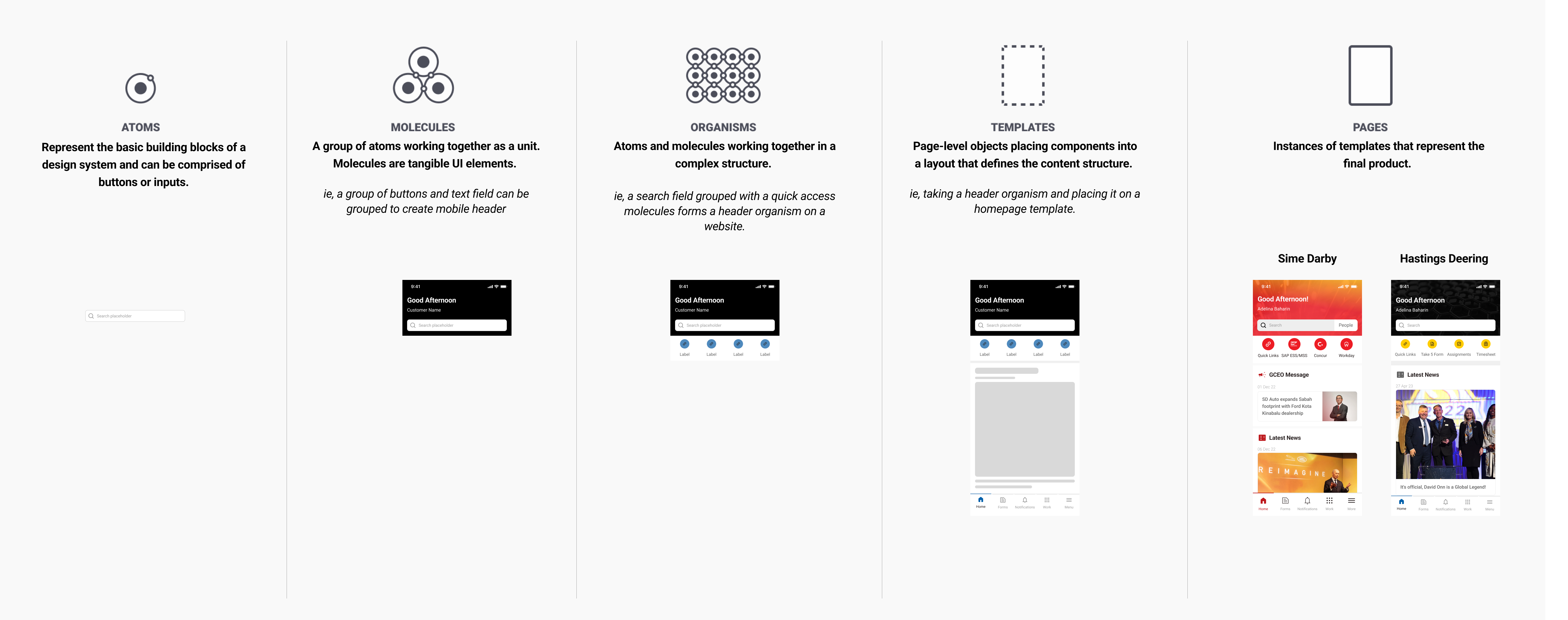
Workflow
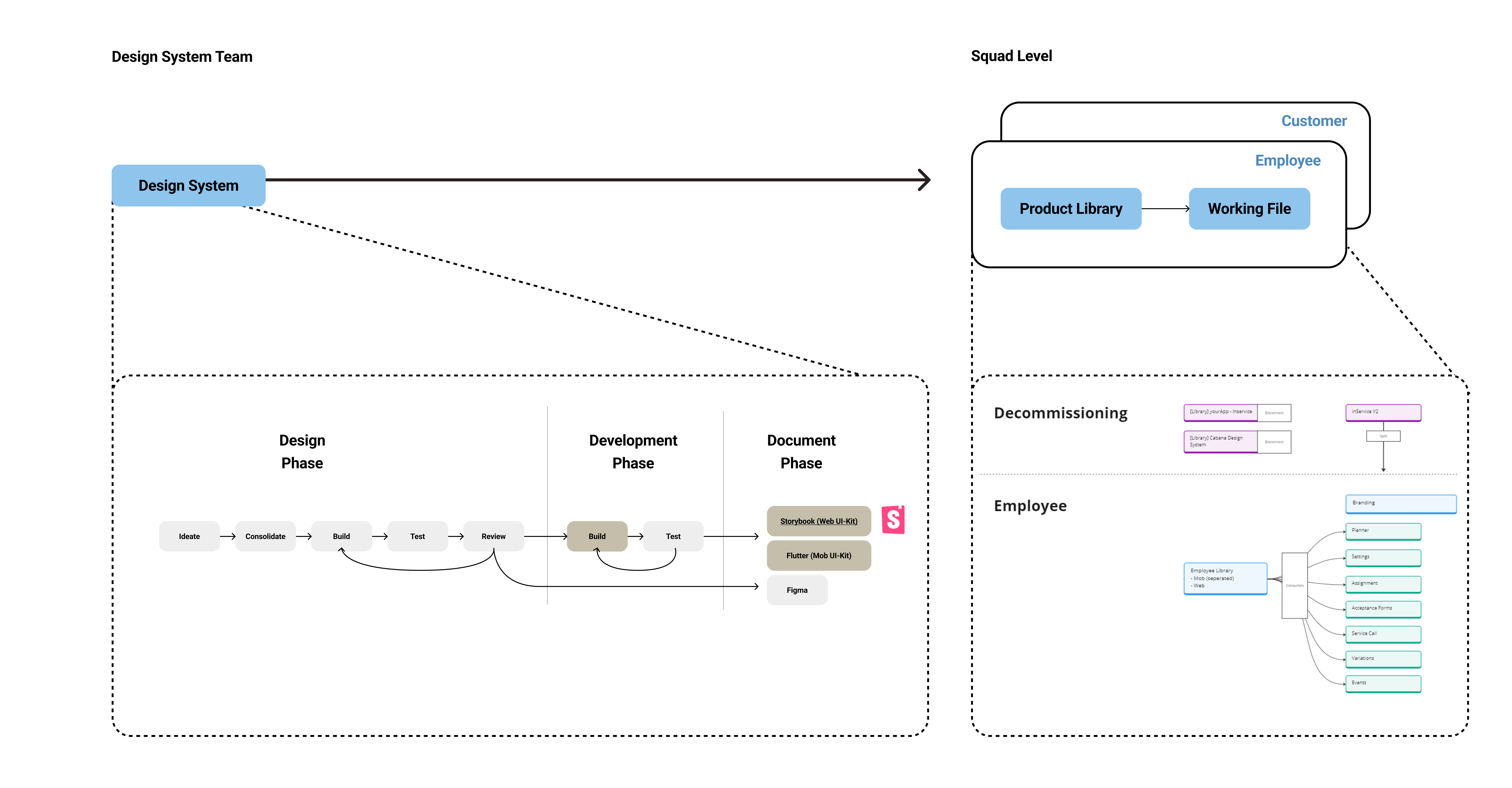
Recall the team’s previous workflow— it wasn’t particularly effective, was it?
The Design System team holds the responsibility of crafting components from inception to integration into the UI-Kit for developers to implement. This empowers tribes using the Design System to concentrate their discussions on product aspects rather than delving into UI or UX details.
Conclusion on my journey
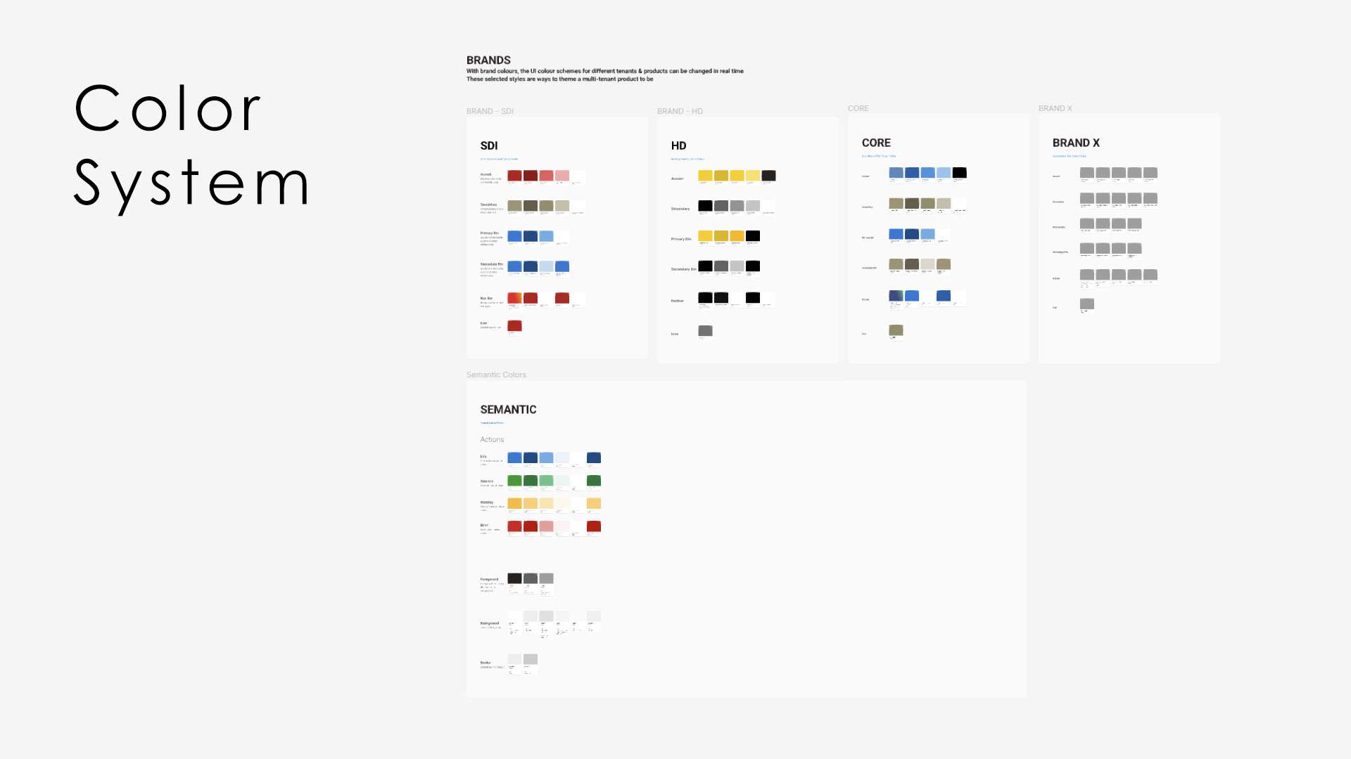
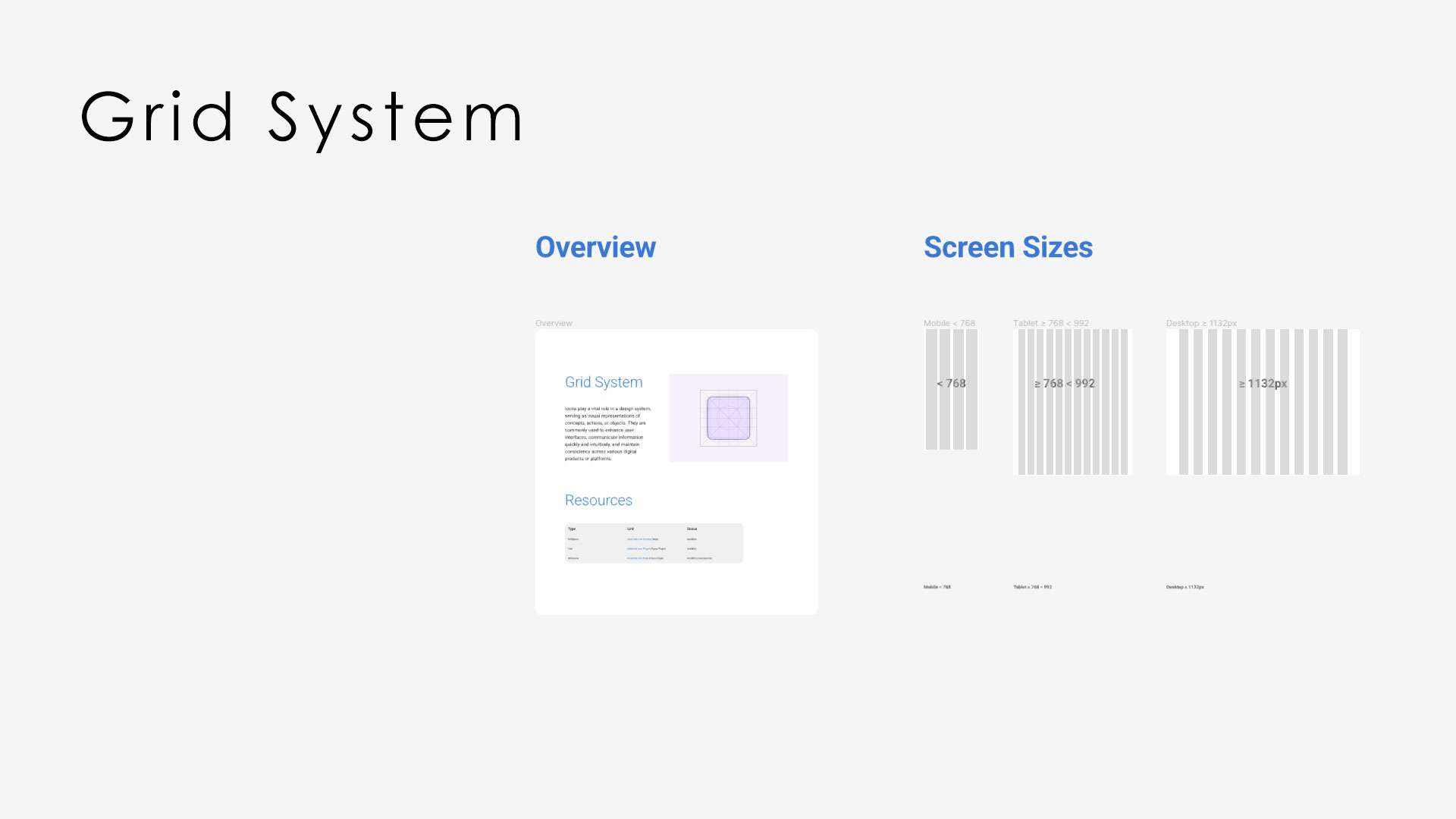
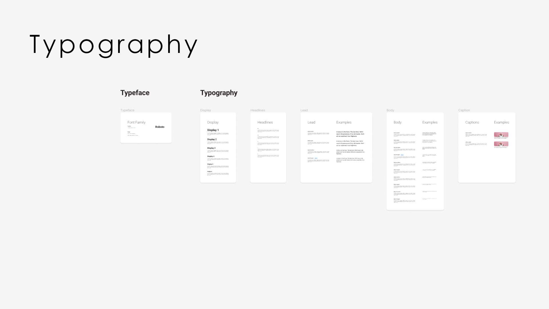
The past six months have been an enriching journey with the team, constructing the design system dynamically while seamlessly integrating all our apps into a unified platform. With 650 components, 300 styles, and continual growth as a live and consistently tested document, the incorporation of components into the UI-Kit resulted in a remarkable 50% increase in design speed. Communication with stakeholders within the digital teams has significantly improved, making our platform’s scaling to another tenant as simple as a click to change branding colors. The design system has evolved into a crucial reference and guide in our day-to-day operations.
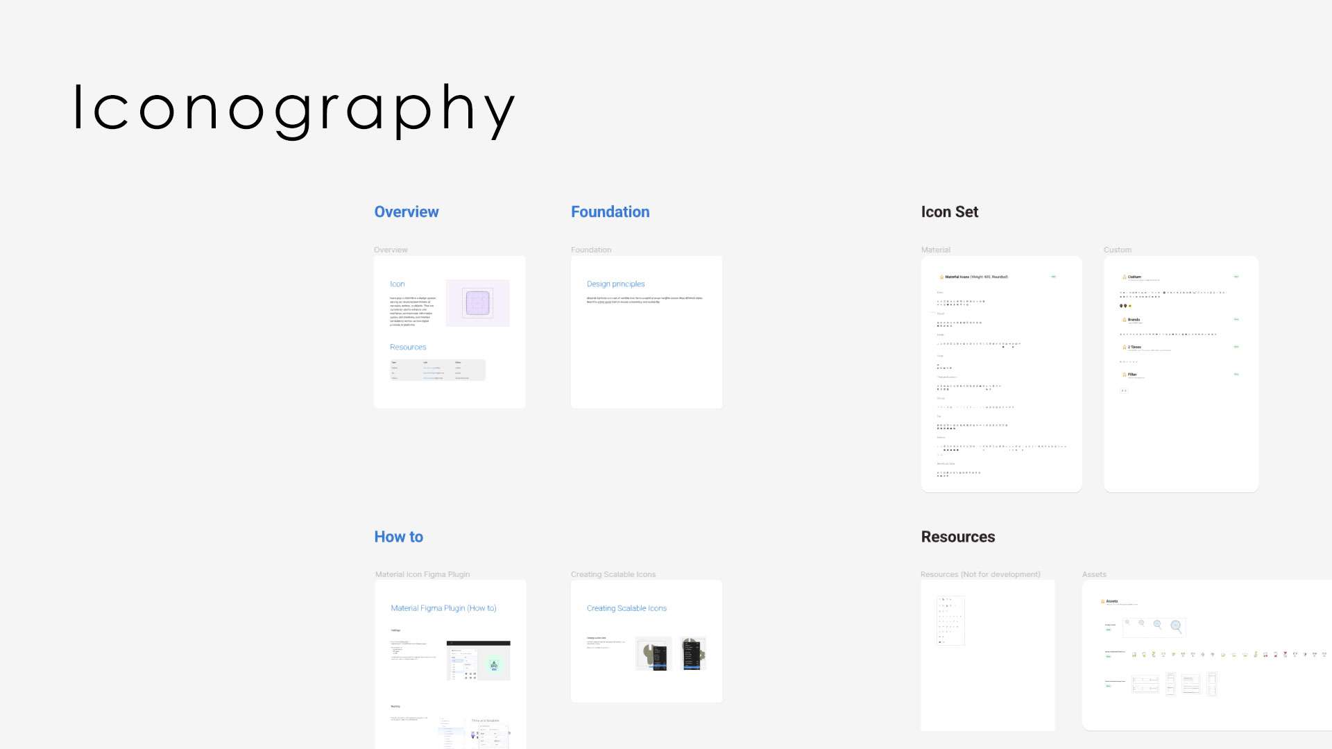
Components
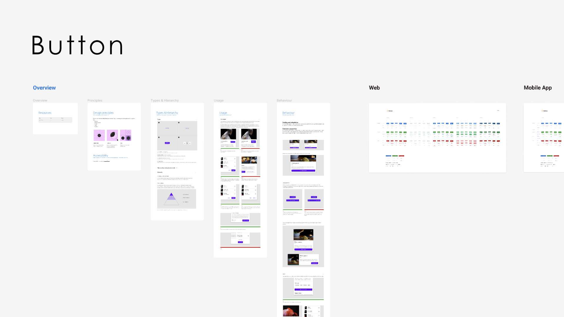
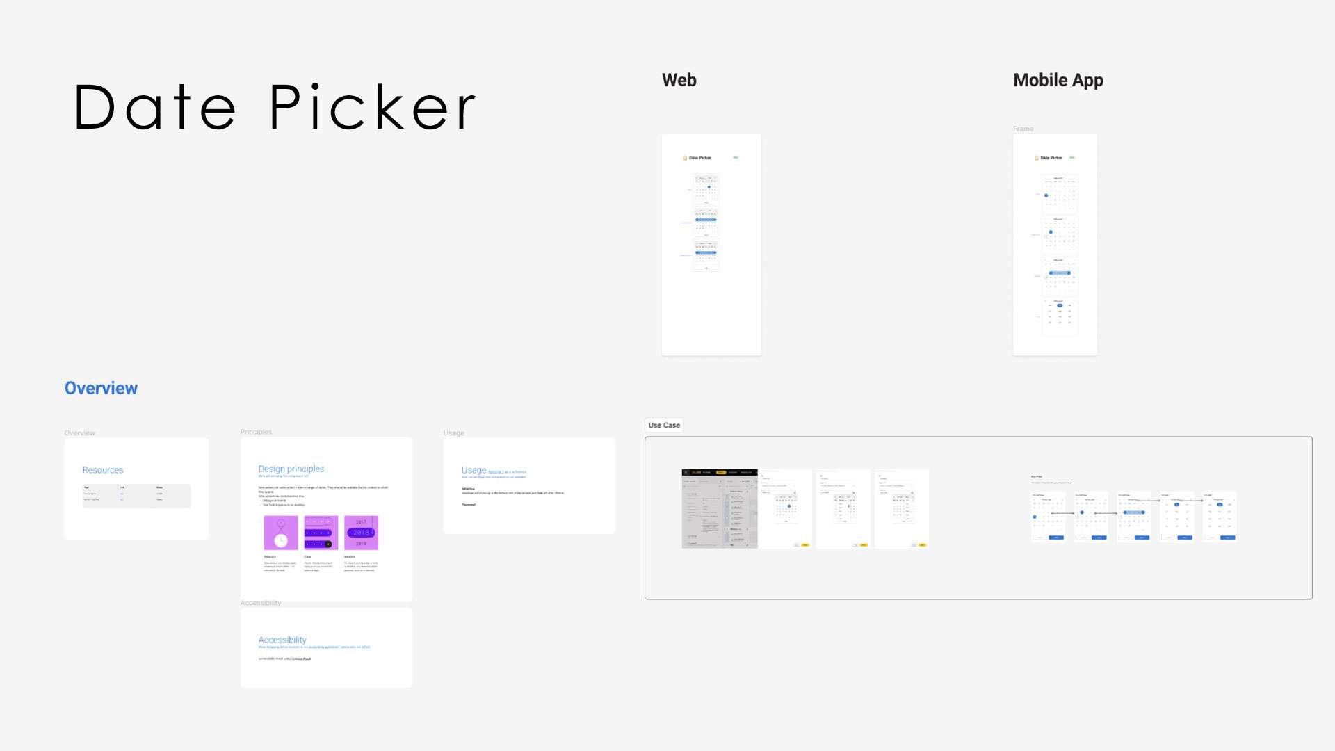
Each component has been meticulously developed with the perspective of a new employee in mind. By referencing the live document, they can comprehensively grasp the principles and varied usage scenarios of the component across our product line.
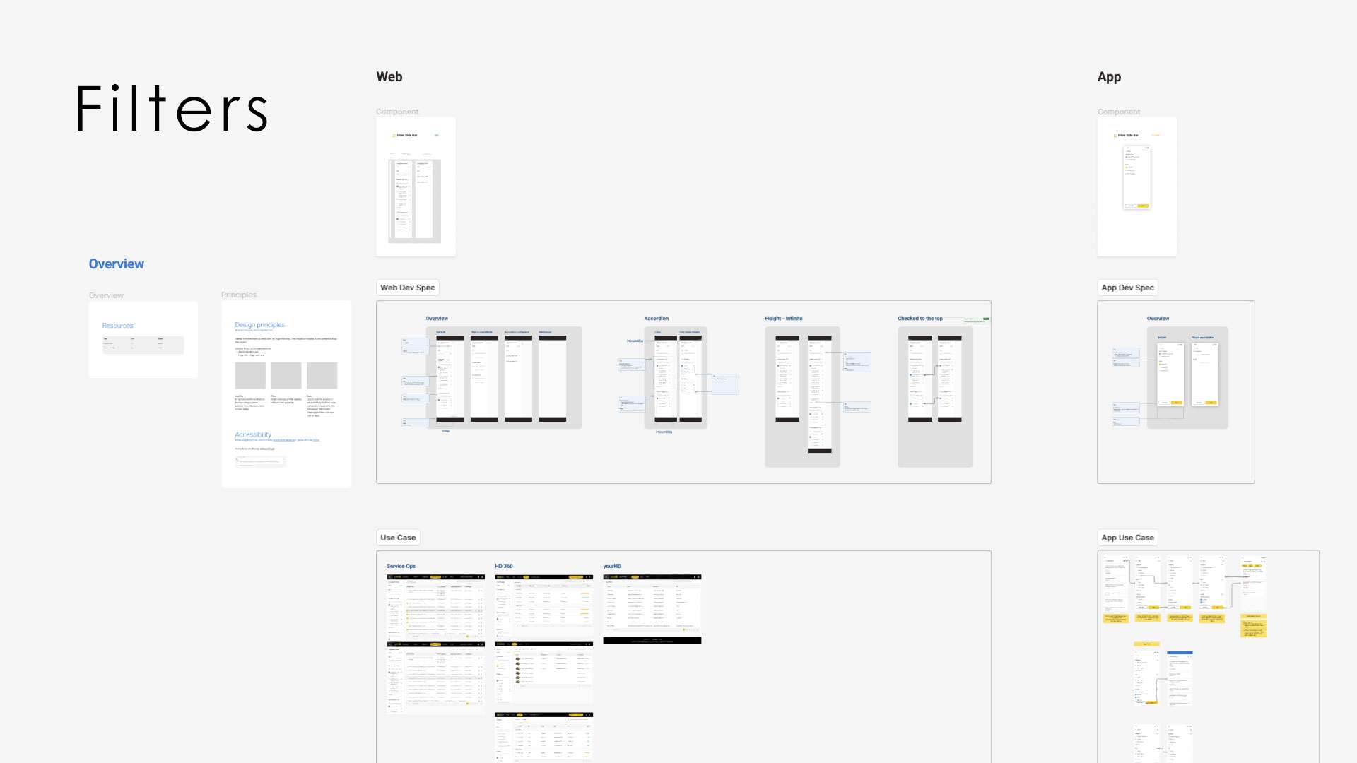
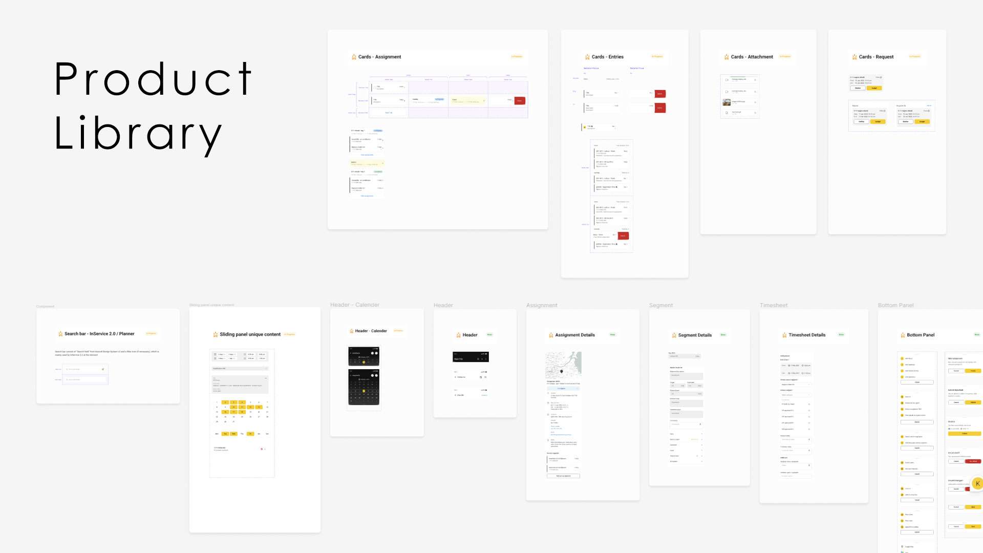
Product specific Library
Product-specific components and templates are exclusive to their respective products, and, as such, they remain within the squad’s dedicated library. Despite the uniqueness to each product, these libraries fully leverage the Incendi Design System. Components are transferred to the Incendi Design System and scheduled for integration into the UI-Kit only when they become commonly used across various products.
This approach ensures building scalable components only when they’ve undergone extensive stress test and use across various use cases within our product lines.
